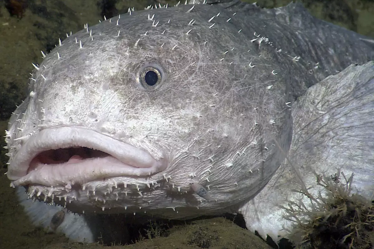
"stop depicting blobfish like this, and blobfish isn't what it's called"
That specific one, as depicted, is blobfish. Blobfish is not a species, it's an individual. Like Greenboots.
A place for majestic STEMLORD peacocking, as well as memes about the realities of working in a lab.

Rules
This is a science community. We use the Dawkins definition of meme.

"stop depicting blobfish like this, and blobfish isn't what it's called"
That specific one, as depicted, is blobfish. Blobfish is not a species, it's an individual. Like Greenboots.
Makes you wonder if you're blobby because you're in the wrong environment.
Perhaps I do belong isolated in the deep dark sea.
In the same vein, stop drawing dead butterflies
Damnit, I'm going to see this everywhere now, aren't I?
Yep.
You’re welcome.
Is kerning the spacing between letters?
Between any typographical characters, but yeah, basically 🙂
It's the visual spacing between letters, which usually involves some letters that have curves or corners to actually not strictly follow the spacing. For example the legs of the letter A might stick out a tiny bit in certain fonts. This gives text a more visually balanced kerning.
Source please or I'll stick to my previously unchallenged image of ugly blobfish