this post was submitted on 18 Jul 2023
0 points (NaN% liked)

Voyager

7062 readers
26 users here now

The official lemmy community for Voyager, an open source, mobile-first client for lemmy.

Download on App Store

Download on Play Store

Use as a Web App

Download on F-Droid

Rules

  1. Be nice.
  2. lemmy.world instance policy

Sponsor development! ๐Ÿ‘‡

Number of sponsors badge

๐Ÿ’™

founded 2 years ago
MODERATORS
 

Voting has ended! Congrats to @fer0n@lemm.ee with option B. Thanks everyone for participating! :)


First off, thanks to everyone that participated in our icon contest last week!

I'm excited to show the final three options for you to vote on below!

Overview

Option A

Option B

Option C

๐Ÿ—ณ๏ธ Vote!

โš ๏ธ BEFORE VOTING I encourage you to tap through the links above to see what it's like on your homescreen!

Results of the poll will not be available until it has ended, so no need to make a rushed decision.

~~VOTE HERE: https://strawpoll.com/BDyNEbKeqZR~~

Strawpoll privacy

~~Polling ends in ~24 hours! If there is a tie, I will cast the final vote.~~

top 1 comments
sorted by: hot top controversial new old
[โ€“] Ginjutsu@lemmy.world 1 points 2 years ago* (last edited 2 years ago)

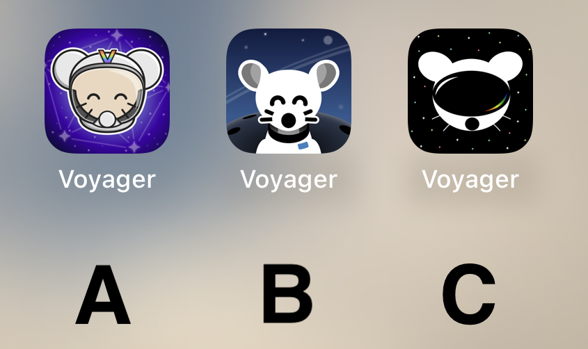
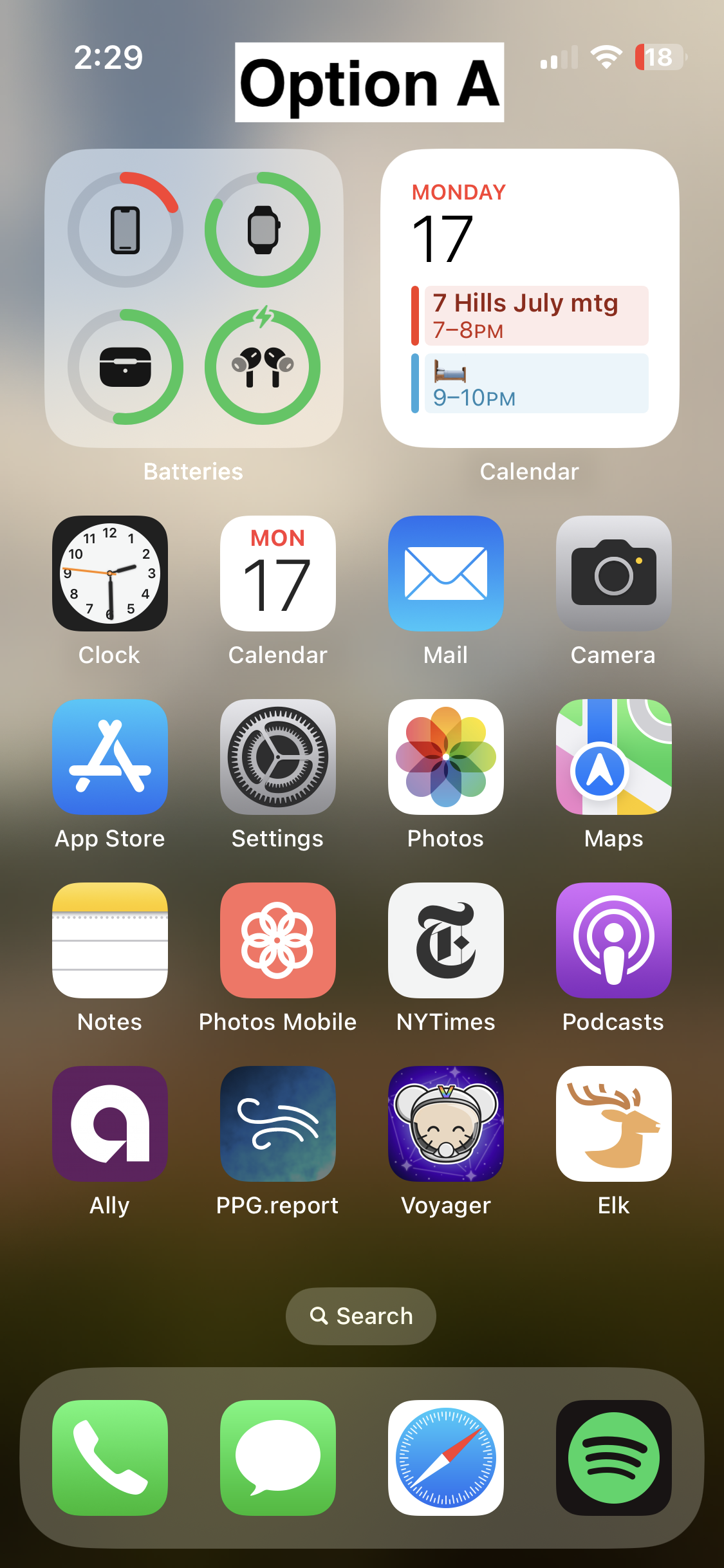
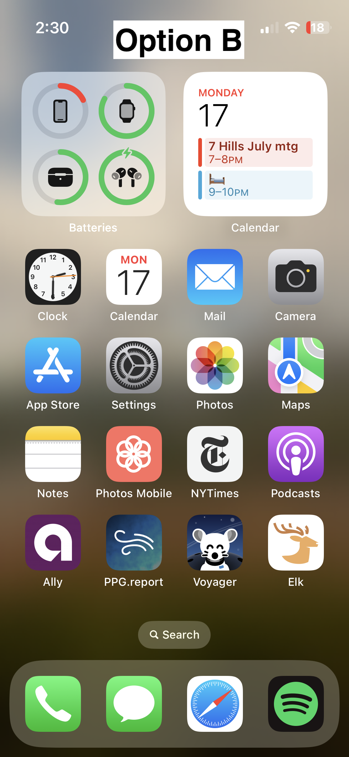
I think B looks the nicest of the three by far. Good use of a monochromatic color scheme, nice balance between background and foreground elements, perfectly readable at a distance.

The design direction of A is a bit busy and stands out a little too much IMO, it looks kind of out of place next to stock iOS apps. C looks a bit too amateur, and has several tangents in it that really bother me - I do like the overall idea of it, but it could really use a rework.